Finding retrofit demand in social housing is not just about spotting poor EPC performance and calling it an opportunity.
The challenge is turning a messy set of housing, geography, and efficiency indicators into something that helps a team decide where to focus first. That is what makes the difference between a dataset that looks impressive and one that is actually useful.
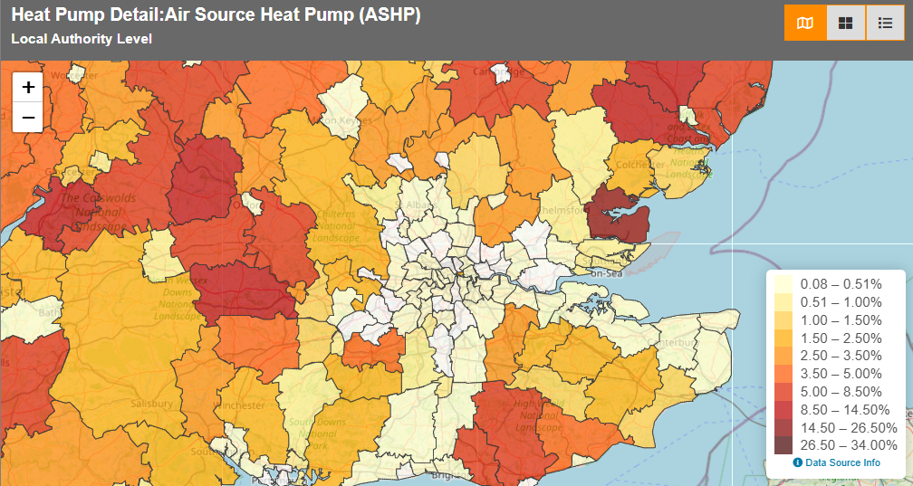
Start with areas, not individual properties
One of the biggest mistakes in retrofit targeting is expecting too much precision too early.
In practice, a lot of the value sits at area level:
- seeing where lower-performing stock appears to cluster
- comparing one patch against another
- understanding where retrofit-related conditions may be more concentrated
- prioritising the parts of a territory that deserve deeper attention
That is a better place to start than pretending a top-level view can tell you exactly which landlord owns which property or which project will definitely move next.
For commercial targeting, area-level planning intelligence is often the most practical first step.
Decide what “demand” actually means for your team
Retrofit demand can mean different things depending on the offer.
For some teams, it means likely need:
- lower EPC profile
- greater improvement headroom
- poorer insulation indicators
- stock characteristics that suggest stronger upgrade potential
For others, it means a more commercial blend of factors:
- where the stock signals look relevant
- where the geography fits current sales coverage
- where local context makes the conversation easier to explain
- where there is enough concentration to justify focused effort
If that definition is fuzzy, the mapping exercise becomes fuzzy as well.
Look for patterns, not isolated datapoints
Useful retrofit mapping usually comes from combining signals rather than relying on one variable.
Examples of helpful pattern-building inputs include:
- EPC Band D or worse, or the split between stronger and weaker efficiency profiles
- potential efficiency improvement percentages
- wall construction and insulation indicators
- roof insulation patterns
- glazing profiles
- fuel type patterns such as mains gas versus off-gas areas
- heating system signals where relevant
Each of those is only part of the picture. What matters is how the pattern looks when viewed geographically.
That is often where the commercial story becomes clearer.
Use territory logic that matches how teams actually work
A common failure point is that analysis gets built in one geography and sold in another.
If your commercial team works by region, sales area, or named territory, the mapping should align to that structure. That way the output can answer practical questions such as:
- Which of our regions should we prioritise this quarter?
- Where should field effort or outreach start?
- Which parts of the patch look broad but shallow, and which look concentrated enough to matter?
- Where do we need a closer look before committing time?
That is much more useful than a national map with no link to how the team actually operates.
Add local drill-down only after the regional picture makes sense
A good workflow is:
- Start with regional comparison.
- Identify the patches that appear strongest.
- Drill into smaller local areas to understand what is driving the pattern.
- Use that narrower view to support account selection, messaging, or deeper investigation.
This reduces the risk of overreacting to a single neighbourhood or small anomaly before the broader opportunity is understood.
Be careful about what the map is telling you
Retrofit mapping is powerful, but it can be oversold.
What a good map can do:
- reveal geographic patterns
- show concentration and variation
- help teams prioritise effort
- support smarter targeting
What it should not automatically claim:
- exact landlord-property matching
- guaranteed live projects
- certain procurement intent
- perfect prediction of buying behaviour
Being clear about that makes the analysis more credible, not less.
What strong outputs usually look like
The most useful outputs are usually quite simple:
- a regional overview that highlights stronger and weaker areas
- a small set of comparison views across territories
- a quick summary for the selected geography
- the ability to drill into smaller pockets without losing the broader context
That combination helps teams move from “interesting data” to a practical targeting decision.
Where PREEMPT fits
This is the kind of use case PREEMPT is designed to support.
Its value is not just in storing housing-related data. The more useful part is making geographic patterns easier to explore across real sales areas and then drilling down into smaller local pockets when needed. For retrofit and decarbonisation work, that helps teams compare territories, spot concentrations, and decide where effort is most likely to be worthwhile.
That is a more commercially grounded outcome than simply claiming to have a large dataset.
Final thought
If you want to map social housing retrofit demand well, start by asking where a geographic view could help a team make a better decision.
The aim is not to produce a beautiful map for its own sake.
The aim is to make prioritisation easier.
If you want to explore retrofit and decarbonisation patterns by region and drill down into the areas that matter most, PREEMPT can help turn that data into something more usable for targeting and planning.
Comments are closed